Climapse - Online Monitoring Tools: EduMed and EO Browser
Overview
Overview
Keywords: Climate change, meteorology data acquisition, global warming, glacier, climate history, air quality, geographical data comparison, satellite data usage
Disciplines: Earth science, physics, mathematics, ICT
Age level of the students: 12-16
![]()
![]()
![]()

The teacher needs to identify an extreme weather event (heavy and continuous rains, strong wind, heavy snowfalls, tornado, …) that took place in the region where the school is. The closer the event was, the stronger the students’ motivation will be and the more effective the study will be on students’ minds. The students then look for evidence, such as pictures, videos, newspaper articles, reports and stories that covered the event and then search data about this event using a web tool.
The main idea is to help students to create "case studies" using all the data they find with these different tools. In this way, they will be able to find some proof of climate change that can be shared with their peers. A strict correlation between extreme weather events, environment pollution and climate change hasn’t yet been scientifically proven, although evidence strongly suggests it. In any case, there is no doubt that the rising frequency of these events, the pollution and the anthropic activities are connected, which is why teachers should encourage their students to investigate this topic with a clear, curious and scientific mind.
Edumed
Students use the EduMed website and its METEO database. There is no need to register as this is an educational website offering many wonderful features. In the main menu, you can even find a teacher’s room, with a large range of resources.
Clicking on the Data Center pull-down window and by choosing METEO you will be redirected to the online Meteo analysis tool. With the Settings menu, you can immediately select your favourite language, and if you choose the option Full screen you are redirected to a new, wide window in which you can easily analyse anything you want.

On the EduMed website you will find METEO in the 'Data Center' dropdown.
At this point, ask the students to change the date using the button in the left bottom corner, choosing the date where the event you are analysing occurred. After choosing the date, they will realise that they can use the bottom slide bar with the buttons Play and Previous to fine-tune the time to find meaningful events at the right time, running the entire meteorological day.
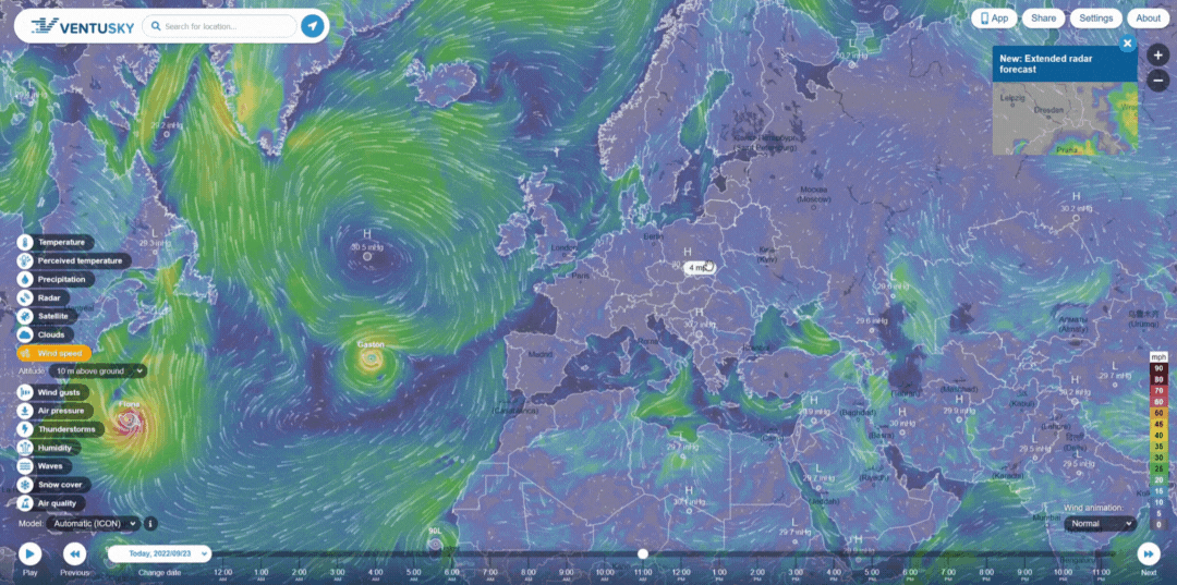
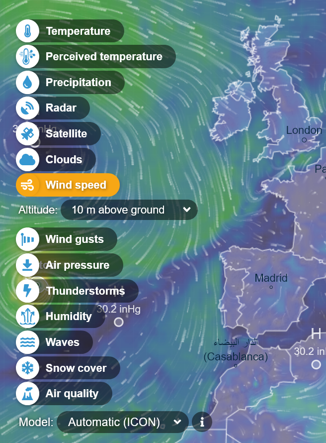
Now, with the leftmost menu, they will choose the physical quantity they need to analyse. They can get animations and time-lapse maps of the temperature evolution, the precipitation quantity variation, the radar-detected precipitations, the cloud coverage, the wind direction and intensity (well represented as vectors with their magnitudes), barometric pressure, humidity, dewpoint, snow coverage, and even air quality. You can see that this is an extremely powerful visual tool allowing a journey into the past showing the atmospheric situation on the day chosen.
Observation and Analysis
After getting all the pictures and animations they need, the students are ready to argue what happened on the day they chose to analyse. You can guide them with the running animation to spot meaningful behaviours of the represented parameters represented.
- How did the temperature develop during the day? What could that mean?
- Which direction was the wind blowing? How could this have affected the event?
- Can you locate areas with heavy snow coverage? How was the snow presence affected by the wind? Could it be increased?
- Explore the pressure animation. Do you see any change during the 2-3 days before the event? What could this mean? Can you spot a sudden drop in atmospheric pressure?
- Explore the cloud coverage. How could it be correlated with the temperature evolution?
For an idea of how I used this website with my classes: one of the activities I did with my students was to look back for a heavy hailstorm which occurred in Modena on 22nd June 2019. What we found by analysing the situation on that day, close to the event, was a sudden drop in temperature, with strong winds with prevalent W-E direction and radar-detected stormy conditions all over the area.
EO Browser
Introductory activity
The aim of this activity is to raise awareness about air pollution and what everyone can do in their daily life to decrease the human impact on the environment.
The teacher introduces the topic asking students to watch a video which includes photos from cities all around the world during the March 2020 lockdown due to the spread of Covid 2019. The point is to ask the students a question and to promote a discussion about the effect of the lockdown on the population and the environment:
Do you think the spring 2020 lockdown had any effects on the natural environment all around the world? If yes, was it positive or negative?
The students write down the positive and negative impacts of the March lockdown on the environment and have 3 minutes to make notes on a (shared digital) board. The teacher guides the discussion starting from students’ notes and trying to highlight the lockdown’s positive effects on the environment. The teacher shows the students an article by the European Environment Agency (EEA) about air pollution emissions in Italy during the 2020 lockdown to verify the students’ hypotheses.
This introduces the students to the health risk air pollution poses in Europe and to underline that this problem is mainly caused by human impact. The teacher shows the European Air Quality Index which is used by the EEA to monitor the concentration of air pollutants, and explains to students why these chemical compounds affect human health.
Video with photos during lockdown from different cities
Looking at air quality
The students now focus on just one air pollutant and carry out an activity to quantify the Air Quality Index before and after the March 2020 lockdown.
To make observations, the students use nitrogen dioxide concentration from satellite data. The European Space Agency (ESA) has several satellites that can detect environmental data such as nitrogen dioxide concentration. In particular, the Sentinel-5 Precursor satellite carries one sensor, called TROPOMI, which is a multi-spectral imaging spectrometer. TROPOMI observes the sunlight that is scattered back to space by the surface of the Earth and by the atmosphere, and it detects the unique fingerprints of gases in different parts of the electromagnetic spectrum. It can detect a wide range of pollutants because it measures the ultraviolet, visible, near-infrared, and short-wave infrared parts of the electromagnetic spectrum. The satellite images that show the nitrogen dioxide concentration are available on the web from the EO Browser, where it is possible to compare images from before and during the 2020 lockdown and evaluate the air quality index. To carry out this activity it can be useful to have a look at:
- The EO Browser user guide
- A presentation by ESA about how to use EO Browser to recognize nitrogen dioxide concentration.
In groups of four, students have one hour to:
- Open EO Browser
- Search for the atmosphere and air pollution theme
- Select nitrogen dioxide data sources
- Select the time range
- Click on “Search”
- Browse the images to find the one you are interested in
- Pin the image
- Browse with the calendar to visualize other images in different time periods (before and during the 2020 March lockdown)
- Observe the images, take notes about data and make comparisons
- Create slides to present to their peers what they have found.
They can use the proposed scheme to carry out the activity and take notes to prepare presentations. All the groups present their results to their peers and the teacher uses the presented data to promote a discussion to define together whether the March 2020 lockdown had a positive or negative effect on the environment.
Air quality in your region
Finally, the students take a look at the air quality in their city. Students can browse European Air Quality Index map and search for the data. Most of the air quality data comes from weather stations in schools all around Europe. The data refers to the previous 24 hours, and the teacher can ask the students some questions, for example if they think that the air quality shows a constant value during the day or if there were some moments during the day when the air quality could be lower.
At the end of the activity, the teacher encourages the students to take action to improve the air quality in their city. Students brainstorm and find ideas on how to improve air quality with some simple actions. Students can write their ideas on a (shared digital) board.
Authors of Climapse: Johannes Almer (DE), Marco Nicolini (IT), Teresita Gravina (IT)
Link to forward to your students
1. EduMed
Share this page